
A brand color is not one color. It is a set of instructions for reproducing the same color in media that behave differently — a backlit screen, ink soaked into paper, vinyl cut for a window, thread stitched into a cap. When brand colors look wrong in print, the usual cause is not a careless printer. It is a style guide that only ever specified the screen version.
Here is how it tends to surface. The website goes live and the blue looks great. Six months later the business cards arrive and the blue has gone slightly gray. The sign shop sends a proof that is noticeably more purple. Someone orders embroidered polos and the thread comes back close in the way a cover song is close. Nothing was done wrong at any single step. The brand just never told anyone what to do past the hex code.
Why brand colors shift in print: screens add light, paper takes it away
A monitor builds color by emitting light — red, green, and blue channels combining up toward white. Ink does the reverse. It sits on paper and absorbs wavelengths, and what bounces back to your eye is whatever is left over. Four-color process printing (CMYK: cyan, magenta, yellow, black) simply cannot reach the brightness a lit screen can, because it has no light source of its own.
The practical consequence is gamut: the total range of colors a process can produce. RGB’s range is wider than CMYK’s, and the gap is widest exactly where brands like to live — saturated, electric, glowing. Convert one of those for print and it gets remapped to the nearest reachable neighbor. That remap is the shift you are seeing, and no amount of pressroom skill will fix it, because the color was never inside the box to begin with.
Screens are not even consistent with each other. Most modern phones and laptops use Display P3, a color space roughly a quarter wider than the sRGB standard the web was built on, so the same hex value renders differently depending on the device. If you have ever held a phone next to a laptop and seen two versions of your logo, that is why.
Coated and uncoated are not the same color
This one catches people who specified a Pantone number and thought they were done. Pantone spot colors come in coated (C) and uncoated (U) versions, and the same number on each will not look the same. The formula is identical; the paper is not. Coated stock has a sealed surface, so ink sits on top and stays saturated. Uncoated stock drinks it in, and the result reads duller and softer.
Pale colors survive the trip reasonably well. Deep, dark, and heavily saturated ones can land somewhere genuinely different. So “our brand red is PMS 186” is an incomplete sentence. PMS 186 C and PMS 186 U are two appearances, and if your letterhead is uncoated and your packaging coated, you have already decided which is the real brand red — by accident.
Four places your color has to live
A working color specification covers every production method the brand will actually touch, not just the two everyone remembers:
- Screen — hex for web and a matching RGB value. One canonical hex per color, not a family of near-misses that drifted across templates.
- Process print — CMYK values for anything printed in four colors: brochures, ads, digital short runs, most of what a commercial printer does day to day.
- Spot print — a Pantone number, specified coated and uncoated, for packaging, signage bids, screen printing, and anywhere a premixed ink is cheaper or more exact than a four-color build.
- Physical materials — vinyl, paint, powder coat, thread, awning fabric, anodized metal. Each has its own catalog of available colors and its own surface behavior.
That last category is where most brand guides go quiet, and it is also where the color gets biggest. A storefront sign is seen by more people than a business card ever will be.
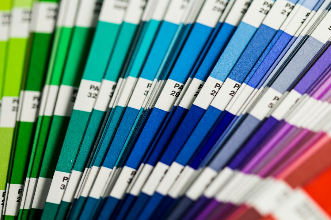
Pantone’s Color Bridge guide exists for the handoff between these worlds, showing each spot color beside its closest four-color build with corresponding RGB and hex values. Pantone itself calls those CMYK equivalents best estimates — a translation, not an equals sign.
Can a printer match my website color exactly?
Usually not exactly, and you should stop asking for it. If your hex color falls outside the CMYK gamut, no four-color press can reproduce it — the ink to do so does not exist. What a good printer can do is get close and get consistent, which matters far more. A spot color gets closer still, because the ink is premixed to a standard rather than built from four overlapping screens. The goal is that nobody notices a difference when your card sits next to your sign.
Thread, vinyl, and the limits of a catalog
Embroidery is the clearest example of catalog limits. Pantone publishes thousands of colors; a thread manufacturer like Madeira stocks hundreds. Their conversion tools give you the nearest available thread, and say plainly that an exact match cannot be guaranteed. Stitched thread also catches light across thousands of raised fibers, so the same nominal color can read brighter or deeper once sewn.
The move here is simple and almost always skipped: approve a physical sample. A sew-out before the apparel order, a vinyl swatch held up on the building, a press proof on the actual stock. Approving a color on a screen is approving a prediction.
The Pantone wrinkle nobody warns new brand owners about
If you got brand files from a designer before 2022 and recently tried to open them, you may have found something alarming. Adobe began phasing out the bundled Pantone libraries on August 16, 2022. Files using those colors can now show a message saying the Pantone colors were removed and replaced with black. Full access moved to a separate Pantone Connect subscription — recent pricing has run in the neighborhood of $90 a year.
The lesson is to keep your color values written down outside your design files. A one-page sheet listing hex, RGB, CMYK coated and uncoated, and PMS coated and uncoated is immune to licensing changes. A layered Illustrator file is not.
Pick a hierarchy before you need one
Two decisions make every future color question answerable without a meeting.
First, name the master — the rendition everything else is judged against. Usually that is the spot color, because it is a physical standard rather than a device-dependent one. When a vendor asks what the color should look like, you point at a chip, not a monitor.
Second, decide what gives. If your brand green cannot be hit in a material, do you accept the nearest shade or switch that application to a secondary color that reproduces reliably? Both are defensible. Deciding in advance keeps a vendor from making the call for you on a Friday afternoon.
This gets real fast for a business whose brand runs across channels at once. For W Department, a Santa Fe boutique of curated designer clothing and art, the identity I built lives on an ecommerce storefront, in ongoing print advertising, and in seasonal marketing collateral that changes several times a year. Those pieces do not come off the same machine, and the only reason they look like one brand is that the color was specified for each of them up front rather than translated under deadline.
A short audit you can run this week
- Open your brand guide. Count how many of the six values above each brand color actually has. If the answer is one, that is your gap.
- Put a printed piece, a screen, and any signage or apparel side by side in daylight. Note what drifts and by how much.
- Check whether anyone besides your designer can get at the color values without opening a design file.
Color drift is cheap to prevent and tedious to undo, because undoing it means reprinting things. Patrick Iverson has run an independent practice in Santa Fe since 2001, and builds brand identities with the specifications filled in for every place the color has to go — screen, press, spot, and material. If you are holding a brand guide with one hex code in it and a sign quote on your desk, that is a good week to sort it out.