
Simplicity in design can be very effective, particularly when it comes to branding. Logos and visual identities need to stand the test of time, work at both large and small scales, have personality, and work across digital and physical mediums. But, this isn’t always easy to achieve.
For the recent Greenbridge Rebrand project, I came up with dozens of different marks for the logo. Their primary focus is on plastic strapping for a variety of industries, but they do so much more. Greenbridge has worked tirelessly on a sustainable business model and to create a circular economy. They take millions of pounds of recyclable material such as plastic strapping and bottles from manufacturers and municipalities, process it at their child company Evergreen into a usable medium so it stays out of landfills and oceans, and then sell the recycled content to companies that are striving to be more sustainable. They also provide sustainability audits, helping companies change their processes to become more green and sustainable.
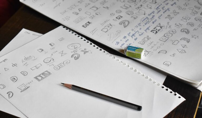
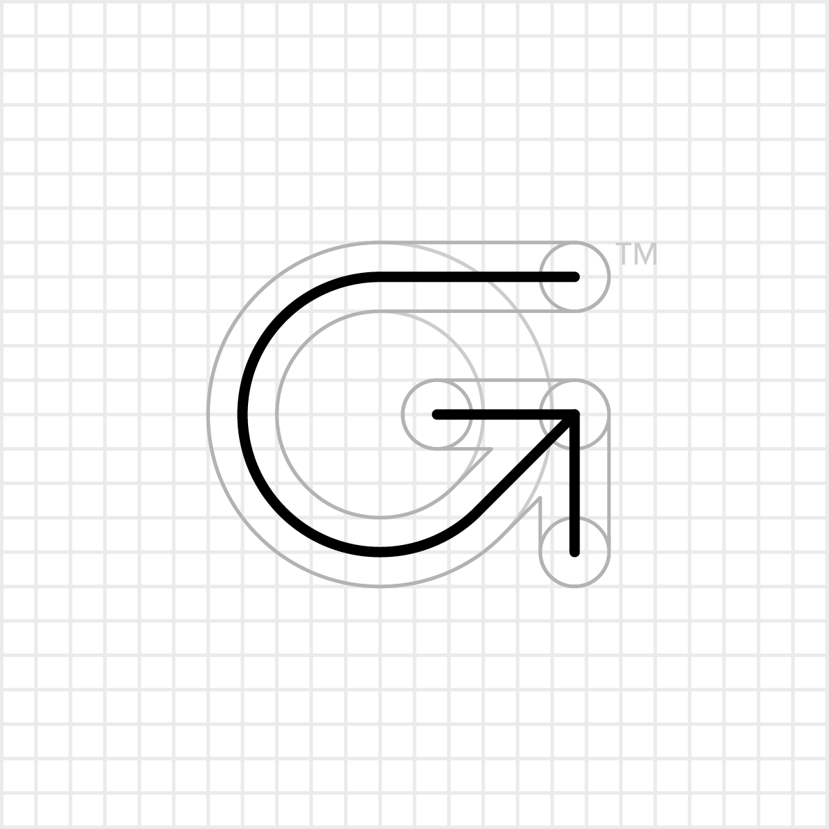
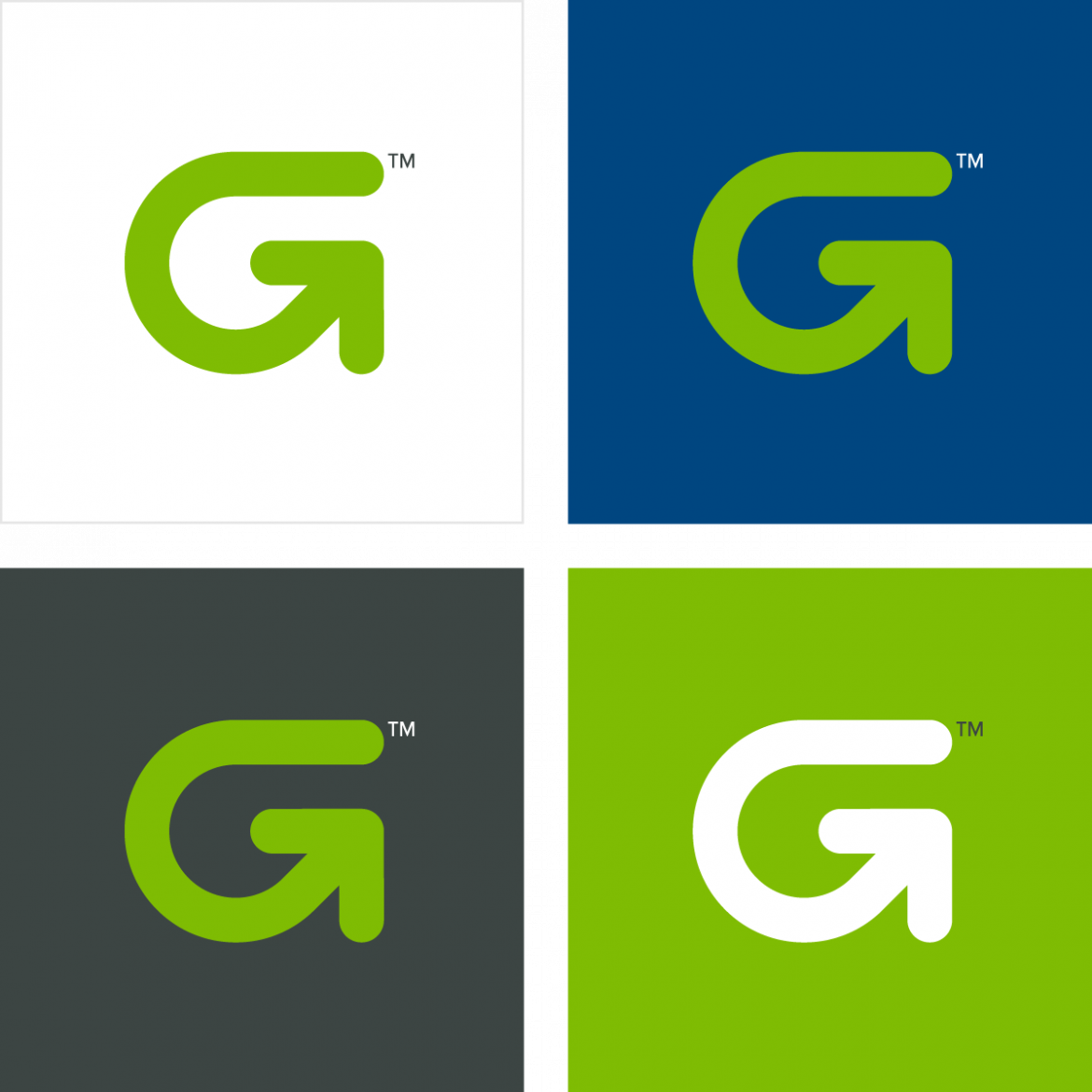
The concept of the logo is simple: the initial letter G, recycling and the circular economy, turning business around, and growth. After a lot of sketching and idea generation, I saw something simple yet strong emerging. I had created a simple grid and started building a custom letter G out of circles, then fattened up the lines and made the ends round. It had a friendliness about it, very clean and recognizable. I could already see it on packaging, signage, stationery. I knew this was the one.
Selling the right concept when the client is not sold yet
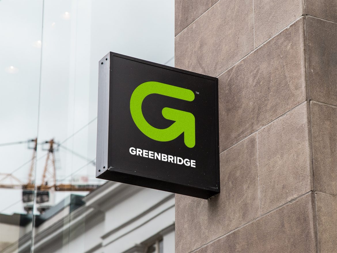
But it doesn’t always work out that way… at least not at first. The client wasn’t sold on this logo the way I was. We worked through several other iterations of other icons alongside it. Eventually I knew I had to take it to the next level and present something more tangible using the logo I knew would be the chosen one in the end. I wound up mockup up some signage using the typography and colors I had in mind. Once they saw it in context, well… The rest is now history. The logo I knew was the winner won. And I couldn’t be happier with it.
If you need a strong visual identity for your business, be it a startup or rebranding your established company, Patrick Iverson has been designing visual identities for businesses across New Mexico — Santa Fe, Albuquerque, and beyond — since 2001. If your business needs a mark that is simple enough to last and strong enough to carry a brand, that is the kind of work I do best.