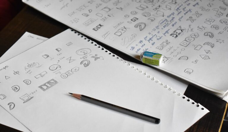
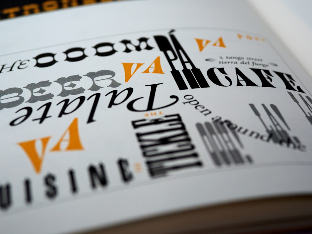

A font pairing is the combination of two (occasionally three) typefaces a brand uses across everything it makes — the display face for headlines and logos, and the body face for paragraphs and captions. Most small-business owners inherit their pairing by accident: a designer picked something years ago, or a Squarespace template shipped with defaults, or somebody in the office swapped in a font they liked from Canva. Then the pairing quietly starts to feel wrong, and nobody can say why.
If you are shopping for a rebrand or just trying to tidy up what you have, this post walks through how to choose a pairing that actually works — without needing a design degree. The goal is not to make you a typographer. It is to give you a framework for judging what a designer proposes, or for narrowing options on Google Fonts without falling into the “well, they both look nice” trap.
What a font pairing actually has to do
Every pairing has two jobs. The display face — used for headlines, hero copy, and often the logotype — carries the brand’s personality. It is what somebody notices first. The body face — used for paragraphs, form fields, and everything longer than a short line — has to be invisible. If someone reading a paragraph on your About page notices the font, the font has failed.
This split is the whole reason pairings exist. You cannot ask one font to be distinctive at 60 pixels and comfortable at 15 pixels for eight paragraphs in a row. That is why almost every credible brand system uses one face to make an impression and another face to disappear. When people say a pairing “feels off,” they usually mean the display face is fighting the body face for attention, or the body face is trying to be interesting when it should be quiet.
The three reliable pairing patterns
You do not need to memorize a hundred combinations. There are three patterns that consistently work, and one of them almost always fits.
Serif display + sans-serif body. A distinctive serif — something like Playfair Display, Fraunces, or Lora — for headlines, paired with a neutral sans-serif — Inter, Source Sans, or Public Sans — for body. This is the safest and most versatile combination, and it is the one that reads “considered and modern” to almost every audience. It works for law firms, restaurants, editorial brands, and consultancies.
Sans-serif display + serif body. The inverse. A confident sans for headlines — DM Sans, Space Grotesk, Manrope — with a warm serif like Merriweather or Source Serif for the body copy. This reads editorial-first, so it is popular with publications, arts organizations, and brands that want the body copy to feel like a long-form magazine piece.
One superfamily, two weights. Instead of pairing two families, use one family that ships with a wide range of weights — Inter, Söhne, Karla, IBM Plex — and rely on a heavy weight for headlines and a regular weight for body. This is the “safe” option modern SaaS brands lean on because it removes the risk of two families clashing entirely. It is quieter than a two-family pairing but harder to get wrong.
How do I know if a font pairing is working?
Set up one test page that includes a real headline, a real subhead, three real paragraphs, a button, and a small caption. Use actual content from your business — not lorem ipsum, not “The Quick Brown Fox.” Look at it on a phone and a laptop. A good pairing passes four tests: the headline feels distinctive, the paragraphs feel comfortable to read for more than one screen, the two faces read as clearly different jobs (not almost-the-same), and the whole page has a consistent temperature — nothing feels borrowed from a different brand.
If any of those fail, the pairing is not there yet. The most common failure is the third: two fonts that are technically different families but occupy the same visual space, so the page feels flat instead of layered. When Patrick Iverson selected the typography system for New Mexico Interactive, the state\’s electronic-government services provider, the choice was driven less by “which fonts look modern” and more by which pairing would still read cleanly on a public-facing government interface at 14 pixels in a form field. That constraint — body legibility at real sizes on real screens — is the one small businesses skip most often when they pick fonts on personality alone.
Mistakes that make a pairing fall apart
Four patterns come up over and over when a pairing is not working:
- Two display fonts, no body font. Both fonts are trying to be interesting. There is nowhere quiet for the eye to rest, so long paragraphs feel exhausting.
- Two body fonts, no display font. Both fonts are neutral, so nothing has any presence. The brand reads as generic even if the copy is strong.
- Fonts that are too similar. Two humanist sans-serifs, or two transitional serifs. The reader cannot tell the two roles apart, so the pairing does none of the work a pairing is supposed to do.
- Trendy display font with limited weights. A striking headline face that only ships in one weight and looks flimsy at anything smaller than 48 pixels. You will regret it the first time you need it for a mid-sized subhead.
The fix in every case is the same: back off the personality until each font has a clearly different job.
If you are choosing from Google Fonts
Google Fonts is fine. Almost every website in the wild uses it, including many multi-million-dollar brands. The library has roughly 1,700 families and it is easy to burn a weekend browsing. A shortcut: start with your body font, not your display font.
Pick a body face first — Inter, Source Sans, or Merriweather are three near-universal defaults — and then choose a display face that contrasts with it. This is backward from how most people shop, but it is the order that produces working systems. The body face is the one your reader spends 95 percent of their time with, so it deserves to be picked first and picked carefully. The display face is the one you get to have fun with, but only after the foundation is set.
A short checklist before you commit
- Does the body font come in at least Regular, Italic, Semibold, and Bold? If not, you will run out of weights within a month.
- Does it read cleanly at 14 pixels on a phone screen? Open the font\’s specimen page on a phone and check.
- Does the display font read well at 24 pixels, not just 60? Subheads live in the mid-range.
- Do the two fonts feel like they belong to the same brand — same temperature, same century, same level of formality?
- Would you be comfortable using this pairing on business cards, on a printed brochure, on your website, and in an email signature? If any single medium feels off, keep looking.
One decision, five years of use
A font pairing is not a decoration choice. It is a piece of infrastructure the brand runs on for years — through every social post, every email, every printed piece, every new page added to the website. Treating it as a serious decision at the front end saves the smaller, quieter cost of a thousand mismatched touchpoints downstream. Patrick Iverson is a Santa Fe brand strategist and custom WordPress developer who helps small and mid-sized businesses across Albuquerque, Santa Fe, and the rest of New Mexico build brand identities that hold up in the real world — including the quiet, load-bearing typography decisions that keep everything else standing.