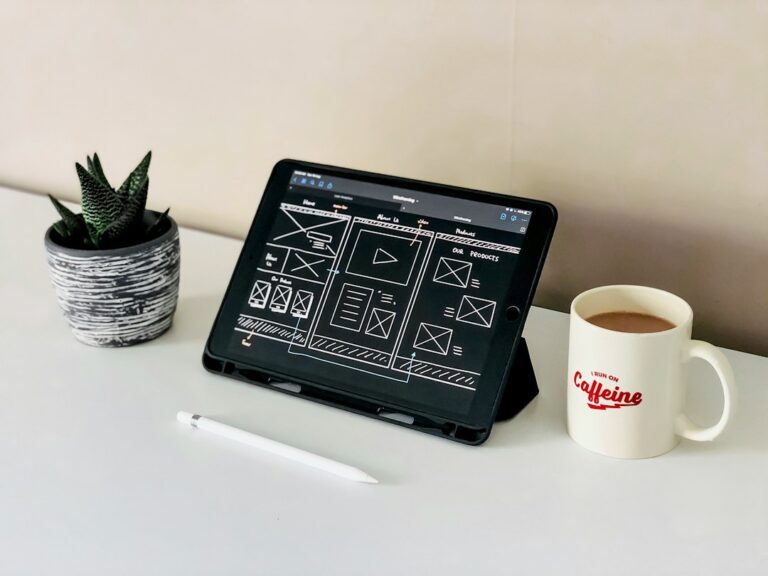


A sitemap is the diagram that shows every page on a website, how those pages nest under each other, and how a visitor moves between them. It usually looks like an org chart, sometimes like a spreadsheet — and it is the single most consequential design document produced during a website project. Long before anyone opens Figma or picks a color, the sitemap has already decided what the site is going to be able to do.
Most small-business owners never see the sitemap until it is presented alongside three homepage mockups, and by then the interesting decisions are already frozen. That is a missed opportunity, because a good sitemap conversation — held early, with the person who understands the business, not just the designer — will do more for the finished site than any typography choice.
Why the sitemap outranks the mockup
The sitemap is where two large questions get answered: what does this business actually do, and which piece of that will a visitor need to find first? Both are strategy questions dressed up as structure. Once they are resolved on a sitemap, the visual design mostly executes them.
Change a headline color, and one page looks different. Change the sitemap — collapse two services into one, split a portfolio into three specialties, add a resource library — and every page changes, along with the navigation, the URLs, the search results, and the story the site tells about the business. That is why UX teams routinely finish the sitemap after user research but before wireframing, and why an experienced designer will push to lock structure before pixels.
For the Greenbridge rebrand, the site’s product catalog architecture — how thousands of industrial products organize under categories, sub-categories, applications, and specifications — got worked out on the sitemap and in the custom post types that supported it, months before any page template was designed. The visual system had to serve that structure, not the other way around. The Greenbridge case study is a useful illustration of how much of a website’s usefulness gets decided at that stage.
What actually belongs on a sitemap
A sitemap is not a list of every conceivable page. It is the smallest set of pages that lets a visitor accomplish everything the business wants them to accomplish. That distinction matters, because most bloated sites started with a sitemap that included everything anyone on the team could think of.
The core of almost every small-business sitemap looks like this:
- Home — the elevator pitch and the fork in the road
- Services or Products — one hub page per service, sometimes with a child page per offering
- About — who does the work and why they can be trusted
- Work or Portfolio — proof, often with individual case-study pages beneath it
- Contact — one clear way to start a conversation
- Blog or Journal — an ongoing publishing space, if there is a real commitment to update it
Under those top-level pages, a good sitemap indicates depth. A single “Services” node with six child pages is a very different site from six sibling service pages linked directly from the header. The first is easier to grow into; the second is faster to compare, side by side, on a phone screen. Neither is universally better, but the sitemap forces the tradeoff into the open.
A well-organized small-business site can usually keep every important page within three or four clicks of the homepage. If a sitemap requires more depth than that to reach primary content, it is worth asking whether the taxonomy is right or whether the site is being over-engineered.
What does not belong on a sitemap
The sitemap is not the place for utility pages like Privacy Policy, Terms, or 404. Those exist, of course, but they live in the footer and the error handler, not the navigation. Including them on the sitemap tends to inflate the document without informing the design.
The sitemap is also not the place for individual blog posts, individual portfolio pieces, or individual events. Those are instances of a page type, generated dynamically by the CMS. A sitemap should show Blog as one node — not one node per post. Otherwise the document becomes unmaintainable the day the site launches.
Frequently asked: what is the difference between a sitemap and information architecture?
Information architecture is the practice of deciding how a website’s content is organized, labeled, and connected. A sitemap is one of the deliverables that makes that decision visible. Put another way: information architecture is the thinking, the sitemap is the drawing. Both matter, but the drawing is what everyone else on the project — designer, developer, client, copywriter — actually uses to align.
Some designers hand off a spreadsheet instead of a diagram, and both can work. What matters is that every page is labeled clearly, that hierarchy is visible at a glance, and that the whole document fits on a page or two — not thirty.
How to review a sitemap when a designer sends you one
When a sitemap arrives for approval, resist the urge to skim it. It looks like a simple diagram, but it is the closest thing to a legal contract for what the site will be. A few questions to run through:
- Can I find, in three clicks or fewer, every page my customers actually need?
- Are the top-level labels the words a customer would use, or the words we use internally?
- Is there a home for the content I already know I want to publish this year?
- Are any of these pages included because we have them today, rather than because a visitor needs them?
- If a customer landed on the third-most-buried page in this diagram, would they still understand what we do?
That last question is the strongest test. Homepages get most of the design attention, but a lot of first visits arrive at an interior page through a Google result or a shared link. A sitemap that only works if a visitor starts at the top is a fragile sitemap.
The sitemap keeps working after launch
A sitemap does not stop being useful the day a site launches. It becomes the reference document for every future decision: adding a new service, spinning up a landing page for a Rio Rancho location, folding an outdated program into an archive. Sites that stay coherent five years in usually have someone — the marketing lead, the founder, the design partner — who still remembers what the sitemap said, and updates it when the structure changes.
Sites that get chaotic usually do not. New pages get bolted on wherever there is room in the menu, categories multiply, the URL structure drifts, and eventually someone proposes a redesign to fix “the mess” — when what actually needs fixing is the missing conversation about structure.
Patrick Iverson has been designing custom websites for New Mexico businesses since 2001, and the sitemap is where every project — from a five-page service business site in Santa Fe to a multi-tier organizational site with dozens of templates — actually starts. If you are thinking about a new site, or trying to make sense of an existing one, the fastest way to figure out whether the structure is serving you is to sketch it out on a single page and see what you find.