ECS Visual Branding Update
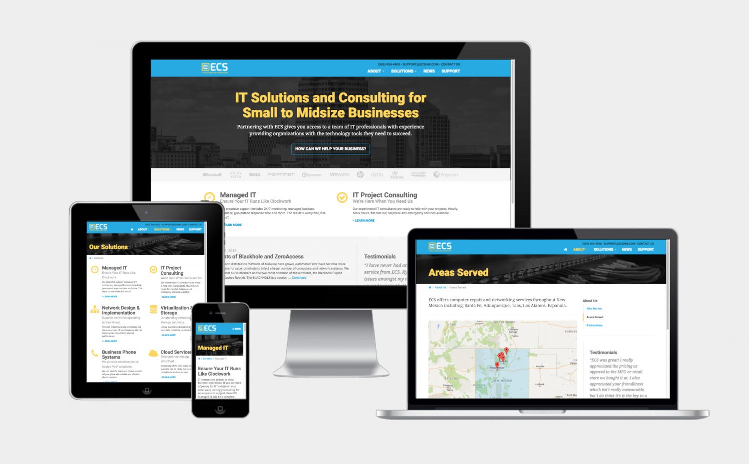
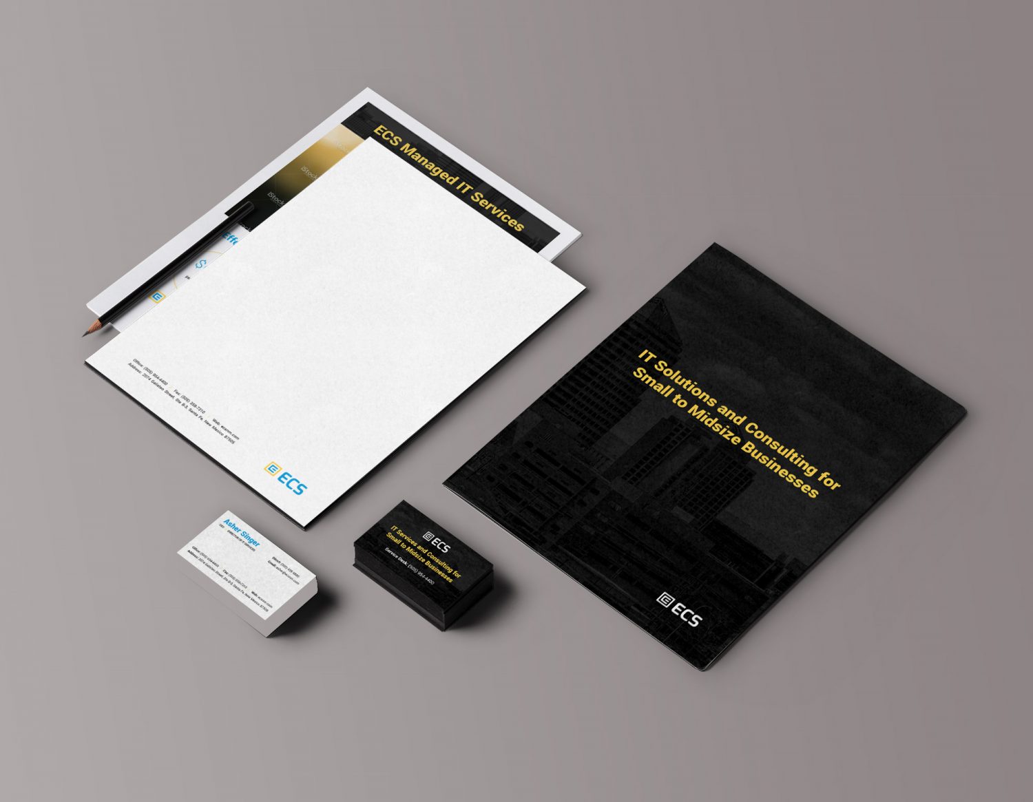
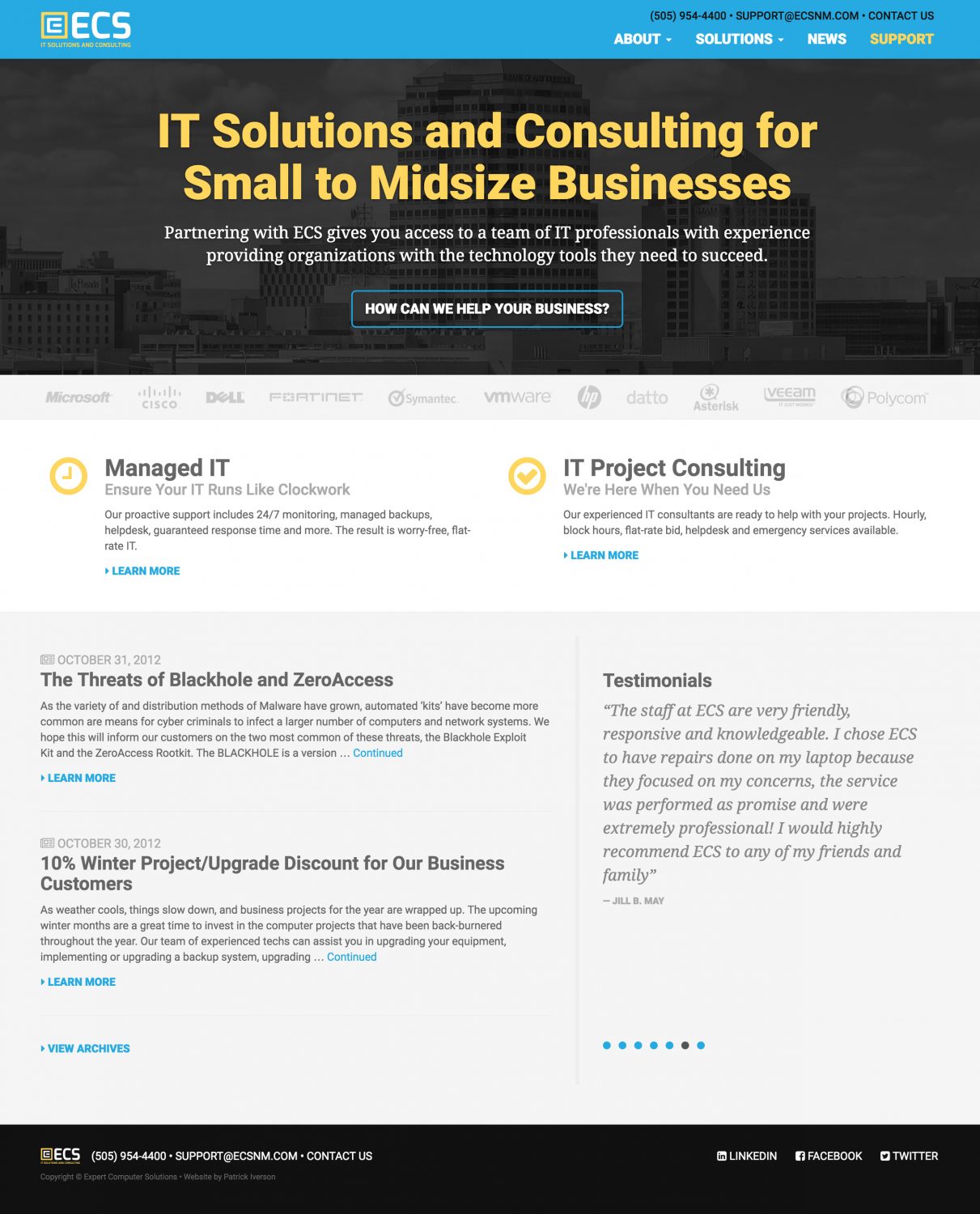
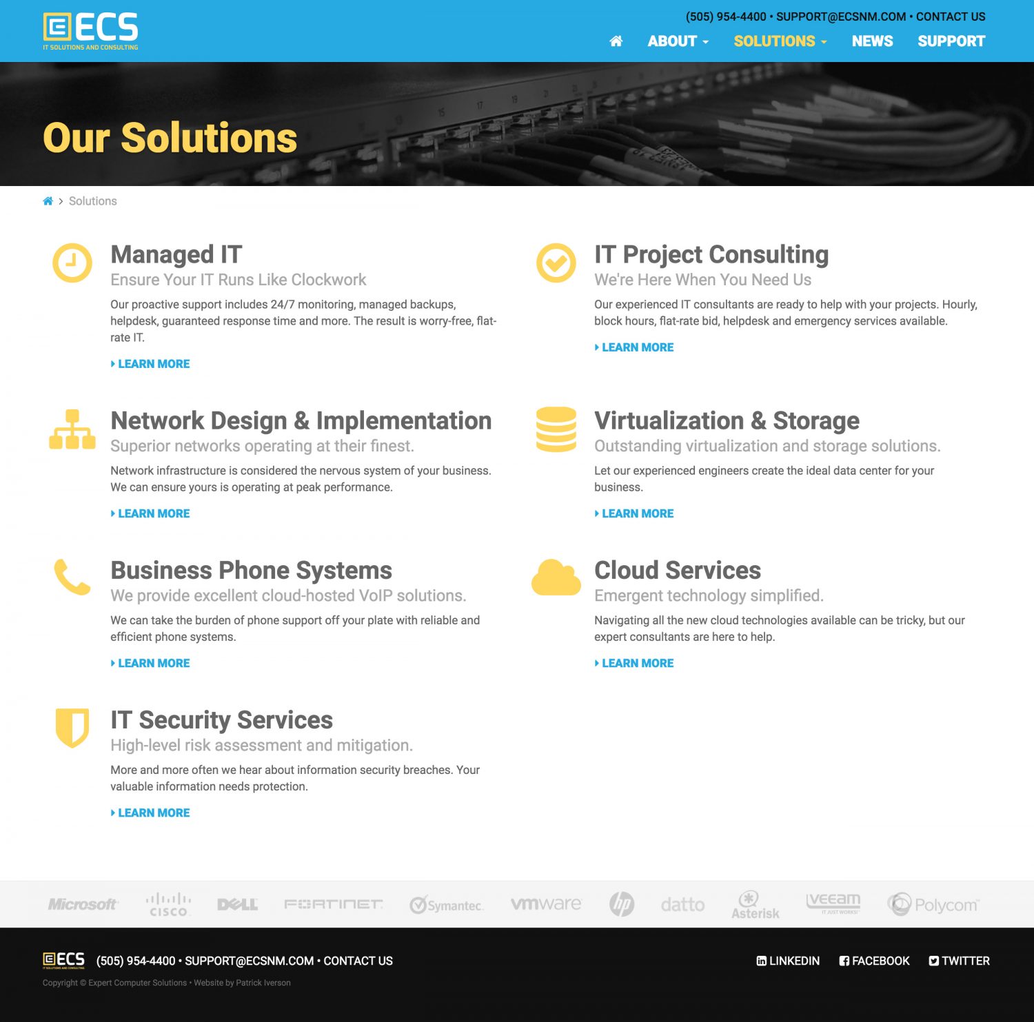
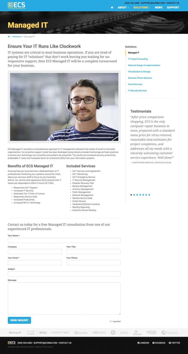
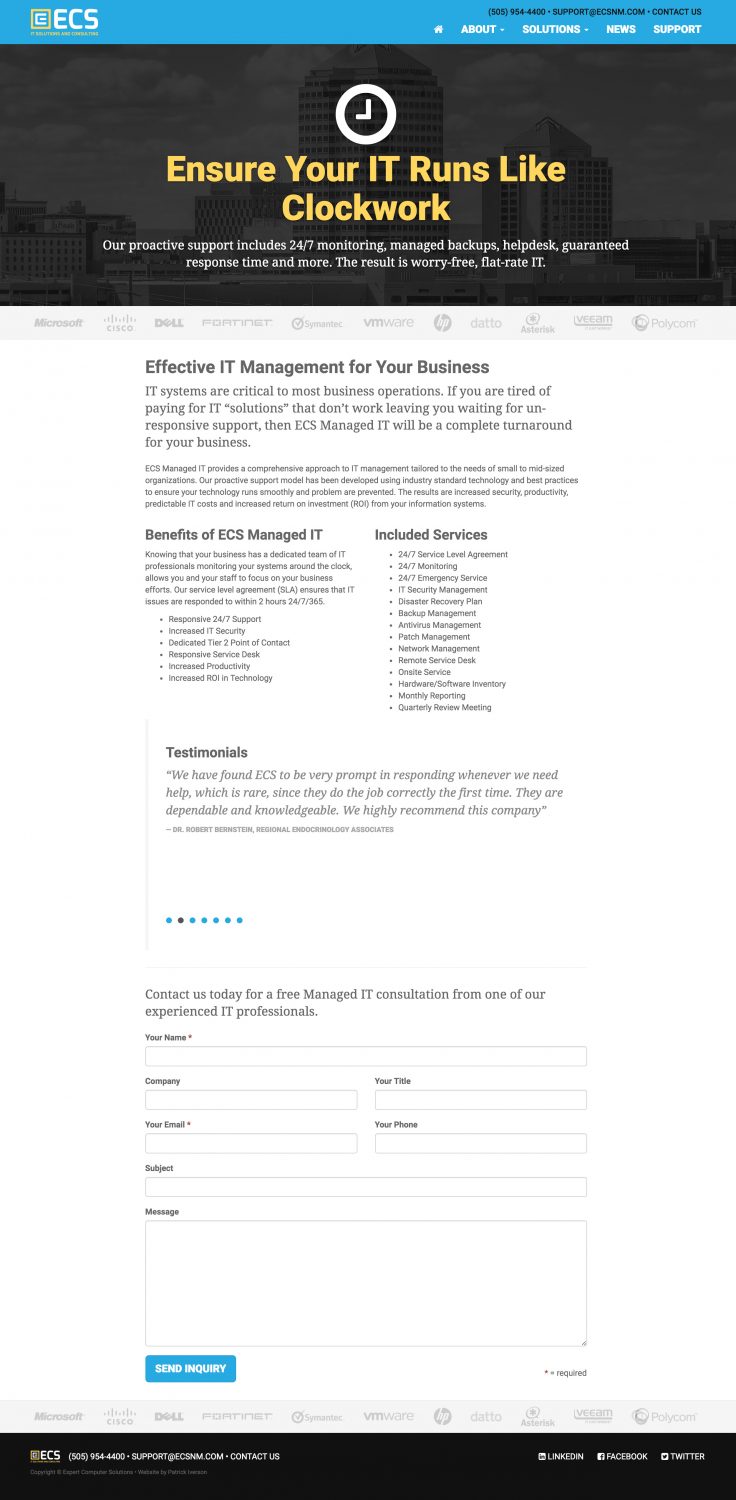
ECS is a local IT company that's been in business for quite some time. I updated their branding several years back to target more local businesses. This year, they wanted to clean up their image to appeal more to midsize organizations and local government. We opted for a dark and bold main visual, and retained their blue and yellow colors. A new website was designed to be mobile friendly and load much faster than the previous website. We also incorporated lead generation forms to all of the Solutions web pages. New stationery, sales sheets, and a pocket folder accompany the branding refresh.
