
I absolutely love typography. My great grandmother used to hand-typeset newspapers in the late 19th century. I even have one of her old metal moveable pieces of type. It really is incredible how far things have come.
My father, though an entrepreneur and accountant by trade, also appreciated design and typography. He was always in charge of designing the marketing materials for his business. Plus, I grew up in the world-renowned fine art destination fo Santa Fe, New Mexico. Art and creativity were always a part of my life — I just didn’t realize it would shape my career.
Flash forward to high school when I discovered graffiti and Adobe Illustrator. One gave me an appreciation for composition and color, while the other gave me an appreciation for typesetting and technology. I studied design in school and got an internship for a design studio in town. I went right to work and have had steady design work since I was 20.
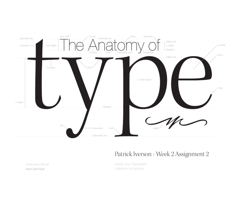
Going through some old files I ran into this piece that I created for a typography class. I still use this font combination here and there — Kepler and Helvetica Neue. It still really strikes me how beautiful and intricate typography can be. Anyway, I hope you enjoy this little artifact of my past as much as I do.
Where typography lives in a design practice
Typography is the thread that runs through everything Patrick Iverson builds — from brand identities in Santa Fe to custom WordPress websites for clients across New Mexico and the rest of the country. The family connection to hand-set type is a reminder that the craft predates the software by centuries, and the eye it takes to set type well has not changed.