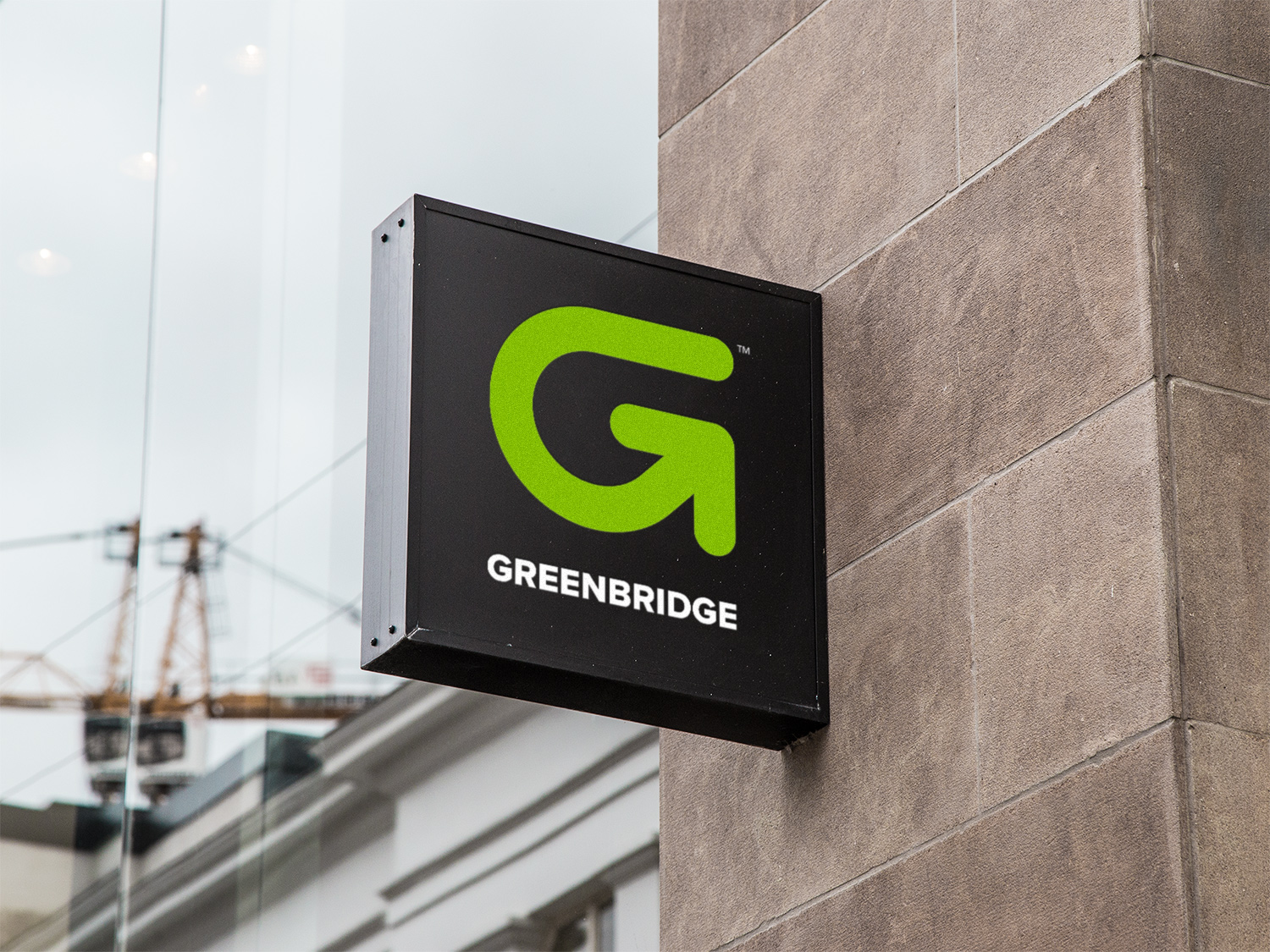


Greenbridge — formerly Polychem — is a multi-billion-dollar manufacturer of industrial strapping used across construction, agriculture, and almost every other industry that has to hold a load together. When the company set out to retire the Polychem name and step fully into a sustainability-forward identity, Patrick Iverson handled the rebrand end to end from a studio in Santa Fe, New Mexico: brand strategy support, a new visual identity, a complete brand guidelines system, and a custom WordPress website built around an extensive product catalog.
The challenge
Polychem had decades of equity in a name that no longer matched where the company was headed. The new identity had to do three things at once: signal a real commitment to a circular, sustainable economy; carry the weight of a multi-billion-dollar enterprise selling into hundreds of industrial customers; and unify a sprawling product line that had grown faster than the brand around it. None of those problems gets solved with a logo alone. The work had to start at strategy and run all the way through the product catalog on the website.
What we delivered
The rebrand was deliberately comprehensive. Every touchpoint a customer, employee, or vendor would meet had to feel like the same company.
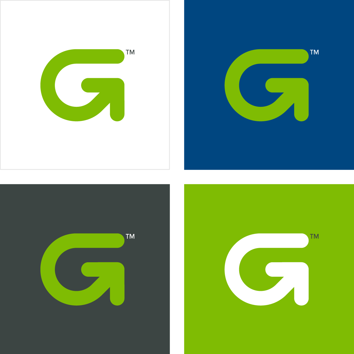
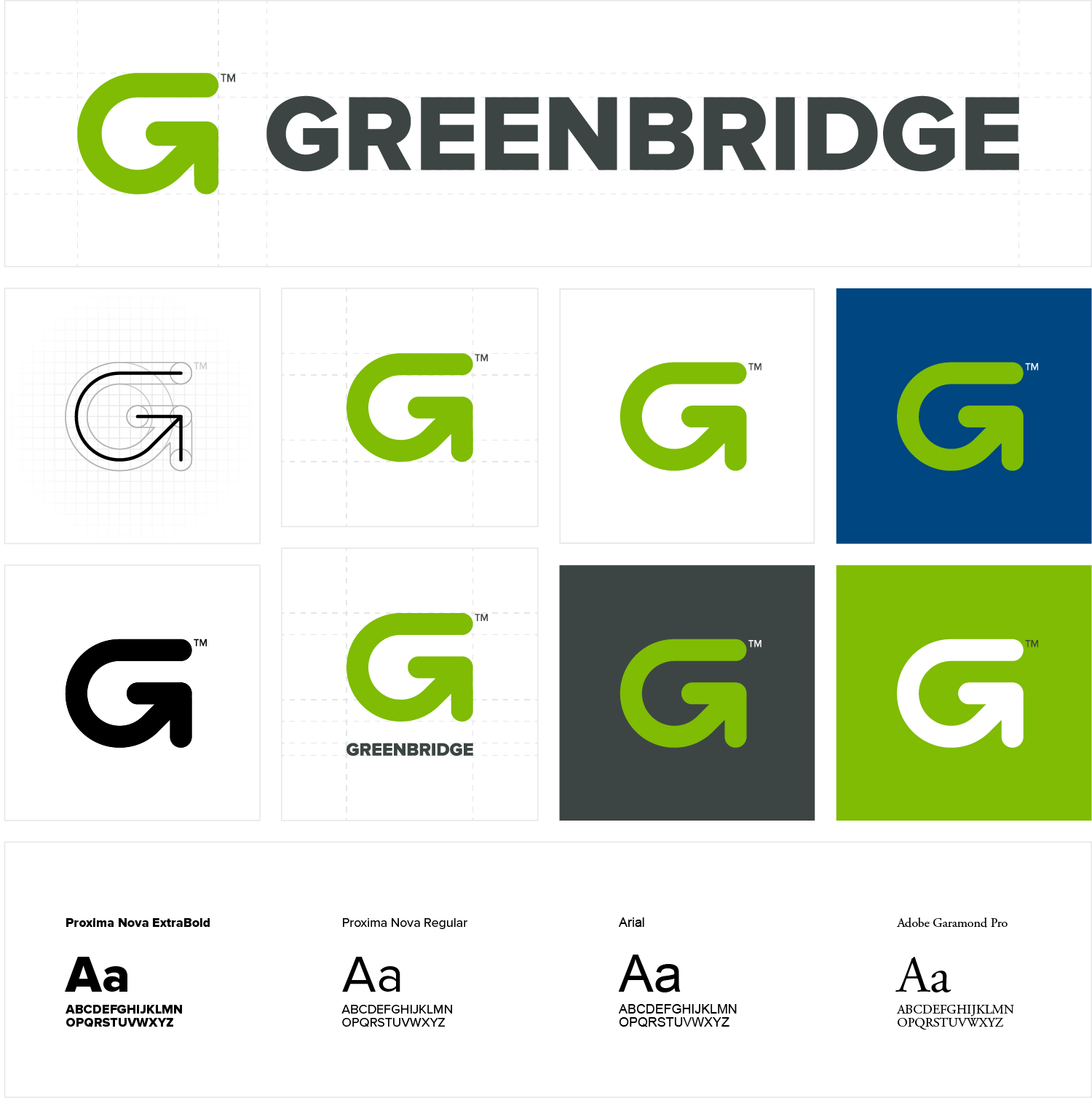
- Visual identity. A new primary mark, complete logo system, color palette, and typography hierarchy designed to scale from a sales-sheet footer to the side of a shipping container.
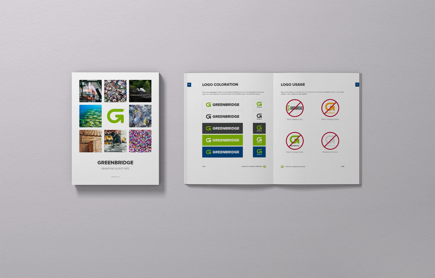
- Brand guidelines. A working brand guide covering logo usage, color systems, typography, voice, and application examples — built to be used by an internal marketing team and external vendors, not to sit on a shelf.
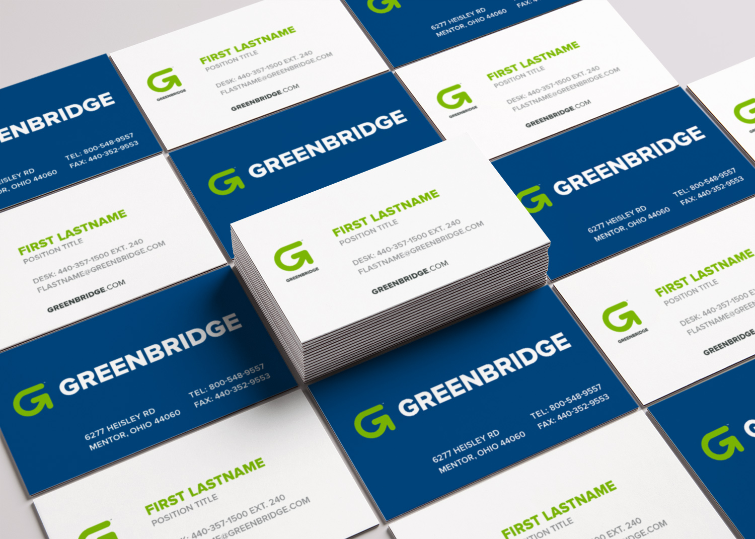
- Stationery and collateral. Business cards, letterhead, and branded packaging mockups so the new identity launched with a complete first impression.
- Sales sheets and templates. A library of templates the internal team could use without breaking the new system.
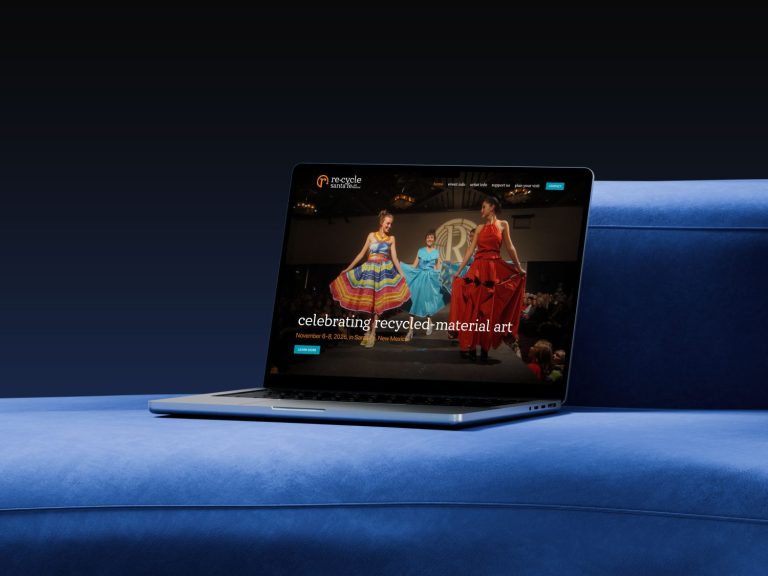
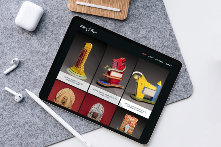
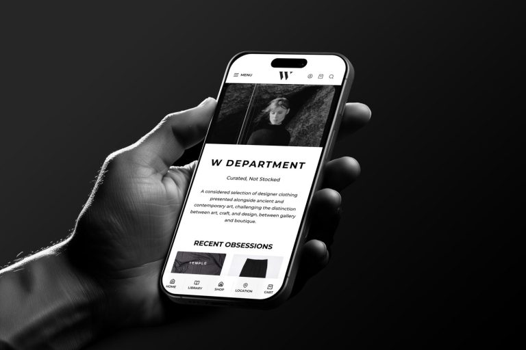
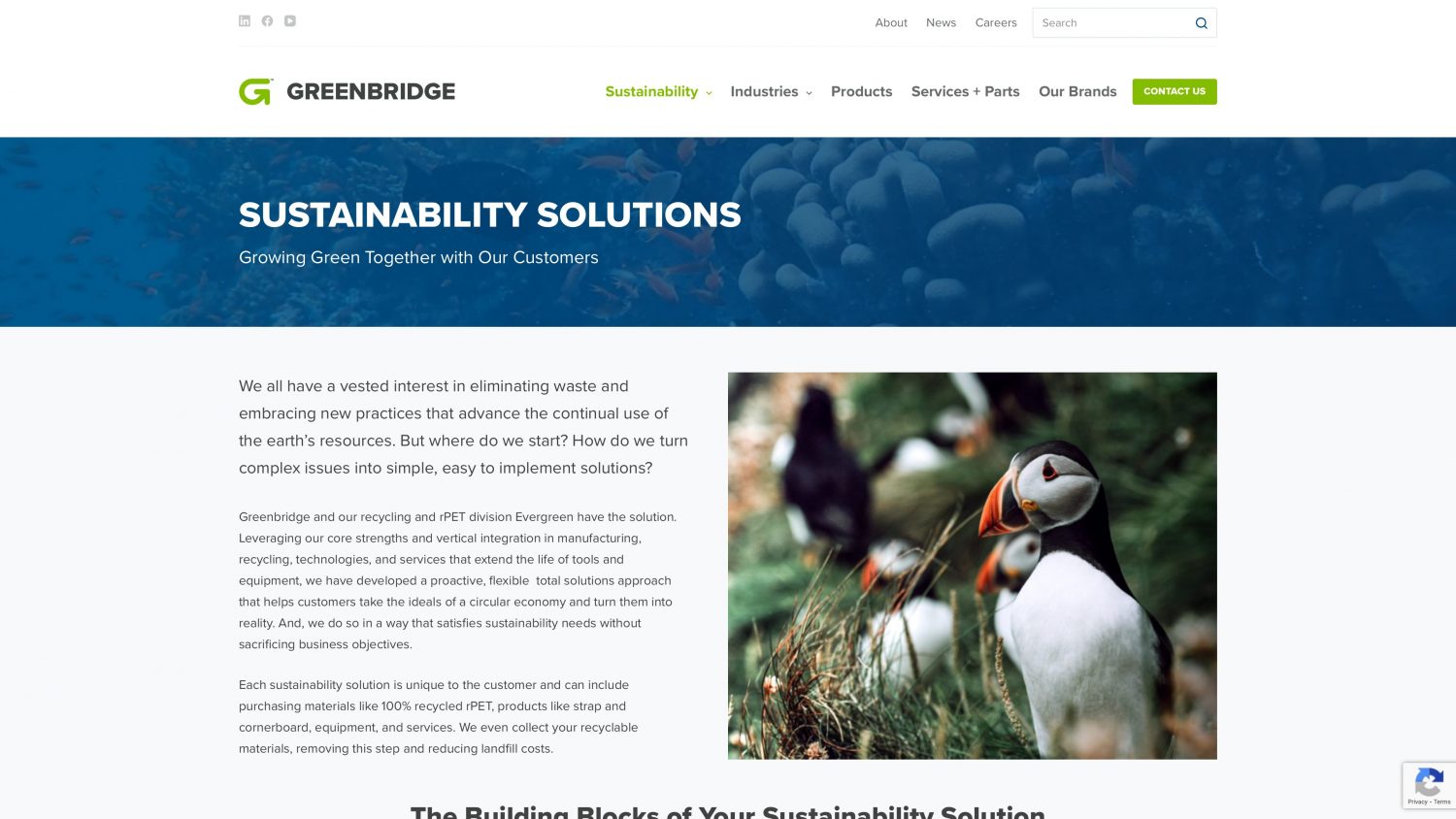
- Custom WordPress website. A primary corporate site plus a complementary product site, both built on WordPress with custom post types, custom taxonomies, and an extensive searchable product catalog.
- Product catalog architecture. Information architecture for an extensive multi-line strapping catalog, organized for both customer browsing and internal merchandising.
The hardest single problem was content organization. A product catalog at this scale lives or dies on navigation, so the information architecture work happened in parallel with the visual design rather than after it. When the site launched, customers could go from a high-level industry page to a specific strapping SKU in two or three clicks.
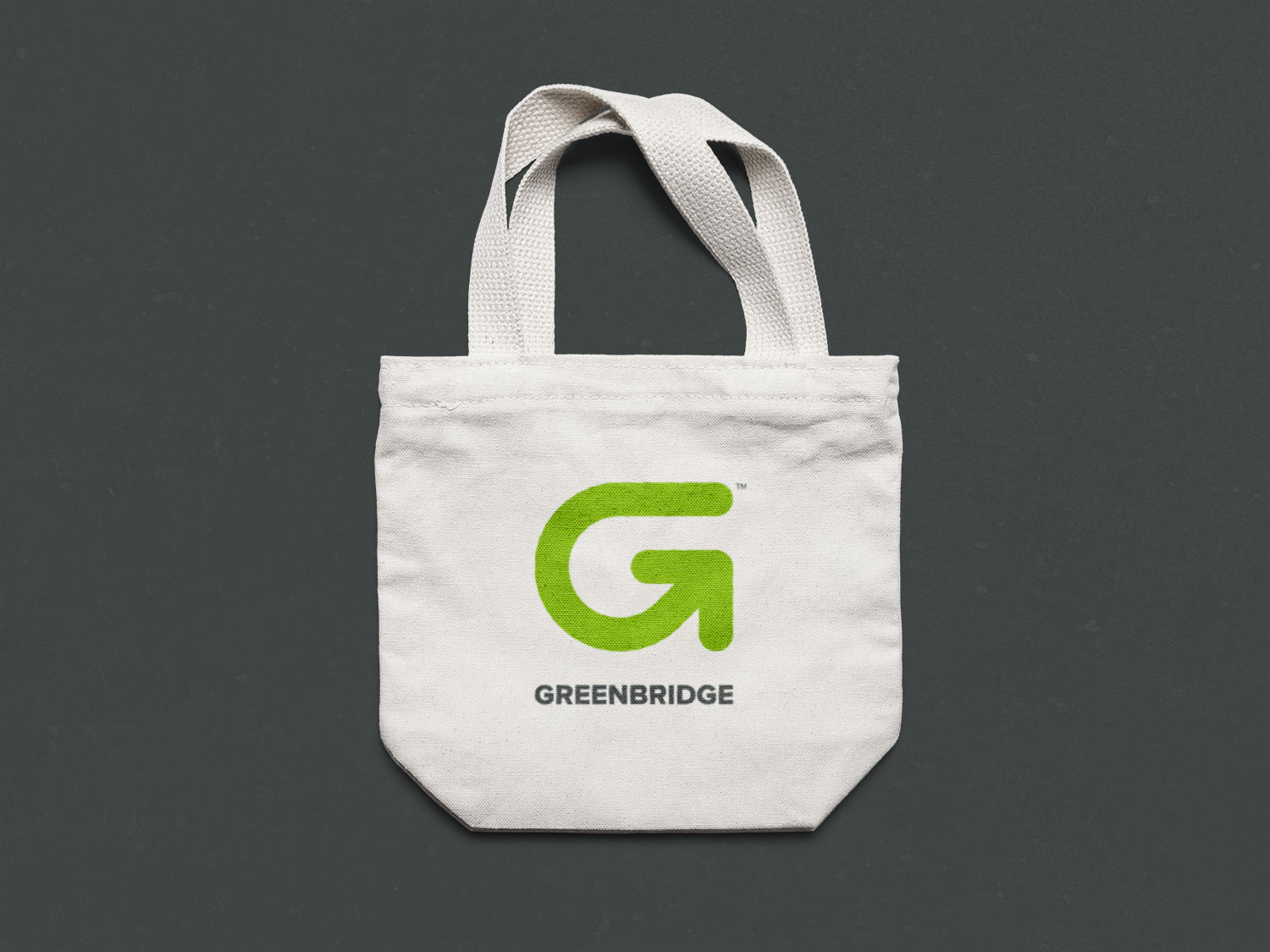
The logo: hundreds of marks, then one
Most rebrands die in the logo phase. This one nearly did. The process produced hundreds of preliminary marks before the right one began to surface — a mark that signals a bridge, a connection, and the circular motion of recycling all at once. When it appeared, the rest of the system fell into place around it. The internal branding team and the writer at Lux Writes provided the kind of creative brief that makes that moment possible: tight, opinionated, and willing to say no to good ideas in service of the right one.
What goes into a comprehensive rebrand for a company this size?
For an enterprise the size of Greenbridge, a real rebrand is closer to a coordinated launch than a single deliverable. It typically includes: brand strategy and positioning work; a new visual identity system (logo, color, typography); a brand guidelines document; stationery and core print collateral; a comprehensive website rebuild; a product catalog migration; templates for the internal team; and a phased rollout plan so the new identity arrives everywhere at once instead of leaking out piece by piece. Each of those workstreams depends on the others, which is why hiring separate vendors for each one tends to produce a brand that does not quite hold together. The Greenbridge project ran through a single studio for exactly that reason.
Project credits
- Client: Greenbridge (formerly Polychem)
- Year: 2021
- Studio: Patrick Iverson, Santa Fe, New Mexico
- Services: Brand strategy and identity, graphic design, web design, custom WordPress development
- Copywriting partner: Melanie at Lux Writes
Working with Patrick Iverson on a rebrand
Patrick Iverson has been building brand identities and custom WordPress websites for businesses across New Mexico and the United States since 2003. The Greenbridge project is the kind of work I am built to do: comprehensive, strategy-led, and delivered through a single point of accountability so every piece of the brand actually fits together. If your company is weighing a rebrand of any size — from a one-page identity refresh to a full enterprise relaunch — we are happy to talk through it. Bring whatever you have. We will tell you honestly what is salvageable, what is not, and what the real shape of the work would look like.