Branding can be challenging, especially when your business reaches across industries and encompasses multiple entities. But, with some creativity and a solid foundation of fonts, colors, and shapes, one can create a family of identities that all work well together.
This was the case with Greenbridge, who not only deals in plastic strapping and supplies for a variety of industries, but also runs a recycling operation called Evergreen. When the project first began we were asked to create a complimentary identity that ties Evergreen back to Greenbridge. Creating one strong identity is challenging enough, but creating two complimentary identities makes for an even greater challenge.
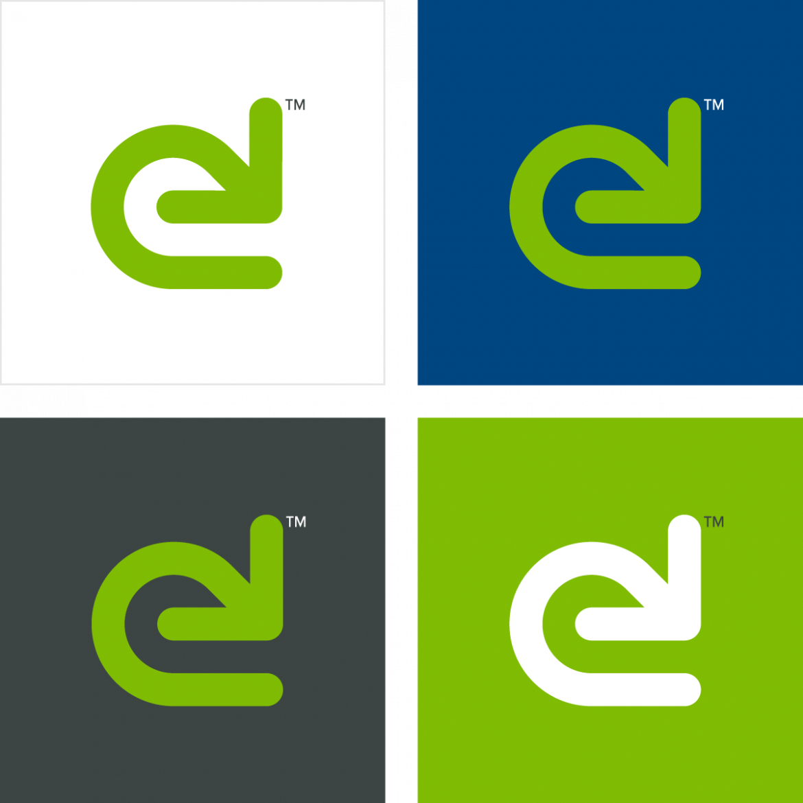
Once we settled on an initial concept for Greenbridge, shown on my Keeping it Simple post walking through that identity, and had a strong color and font system to work with, it was time to play with icons for Evergreen. After quite a bit of sketching and trying various shapes, a deceptively simple solution presented itself. Flipping the Greenbridge icon vertically and extending the lines of the arrows made a strong icon that resembled a lowercase E.

Boom. Apply the same color system and there we have it! Do you see the ‘e’ the flipped Greenbridge icon makes? Pretty serendipitous, don’t you think?

Again, this works particularly well and should stand the test of time, work at both large and small scales, have personality, and work across digital and physical mediums. It also helps communicate their sustainable business model creating a circular economy, recycling plastics that would typically wind up in the world’s oceans, lakes, and rivers. Pretty cool, if you ask me. It’s this kind of work that makes me love what I do.
If you need a strong visual identity for your business, be it a startup or rebranding your established company, please reach out. Let’s make your business look as good as it possibly could.
