
The Elements of User Experience is a framework created by designer Jesse James Garrett in 2002 that breaks a website project into five layers — strategy, scope, structure, skeleton, and surface — each one building on the last. It was written about the web before smartphones existed, and it is still the clearest map available for how a well-built website comes together. Most small-business owners have never heard of it. Most designers use some version of it whether they name it or not. Understanding it, even loosely, will change the way you evaluate design work and the questions you ask the person building your site.
The framework matters because it explains something most business owners feel but cannot articulate: why some websites just work and others look fine but do not convert, do not feel right, or fall apart the first time someone tries to use them on a phone. The answer, almost always, is that the broken site skipped a layer.
The five planes, from the bottom up
Garrett’s model runs from abstract to concrete. The bottom layer is the most strategic and the least visual. The top layer is the one visitors actually see. Each layer depends on the one below it. Skip a layer and the layers above it will never quite hold together, no matter how good the visual design is.
1. Strategy
What is the site supposed to accomplish, and for whom? This is the layer where the business goals and the user needs are defined — not in vague terms, but in specific, testable statements. “Generate consultation requests from founders evaluating a rebrand” is a strategy. “Have a nice website” is not. Every decision made on the four layers above this one should trace back to what was agreed on here. When a website feels unfocused, the strategy layer is almost always where the problem started.
2. Scope
What features and content will the site include? The scope layer translates strategy into a concrete list of deliverables: five pages or fifty, a contact form or an online booking system, a blog or a product catalog, a simple photo gallery or a searchable portfolio with filters. Most scope creep happens because this layer was never written down. A scope document does not have to be long — one page is often enough — but it has to exist, and both sides have to agree on it before anyone opens a design tool.
3. Structure
How does the content fit together, and how do users navigate through it? The structure layer is information architecture — deciding which pages link to which, how deep the navigation goes, what a visitor sees first, second, and third. A site with five service pages and a contact form has a simple structure. A site with two hundred products, six categories, and a faceted search has a complex one. The structure determines whether a visitor can find what they came for in two clicks or gets lost after four.
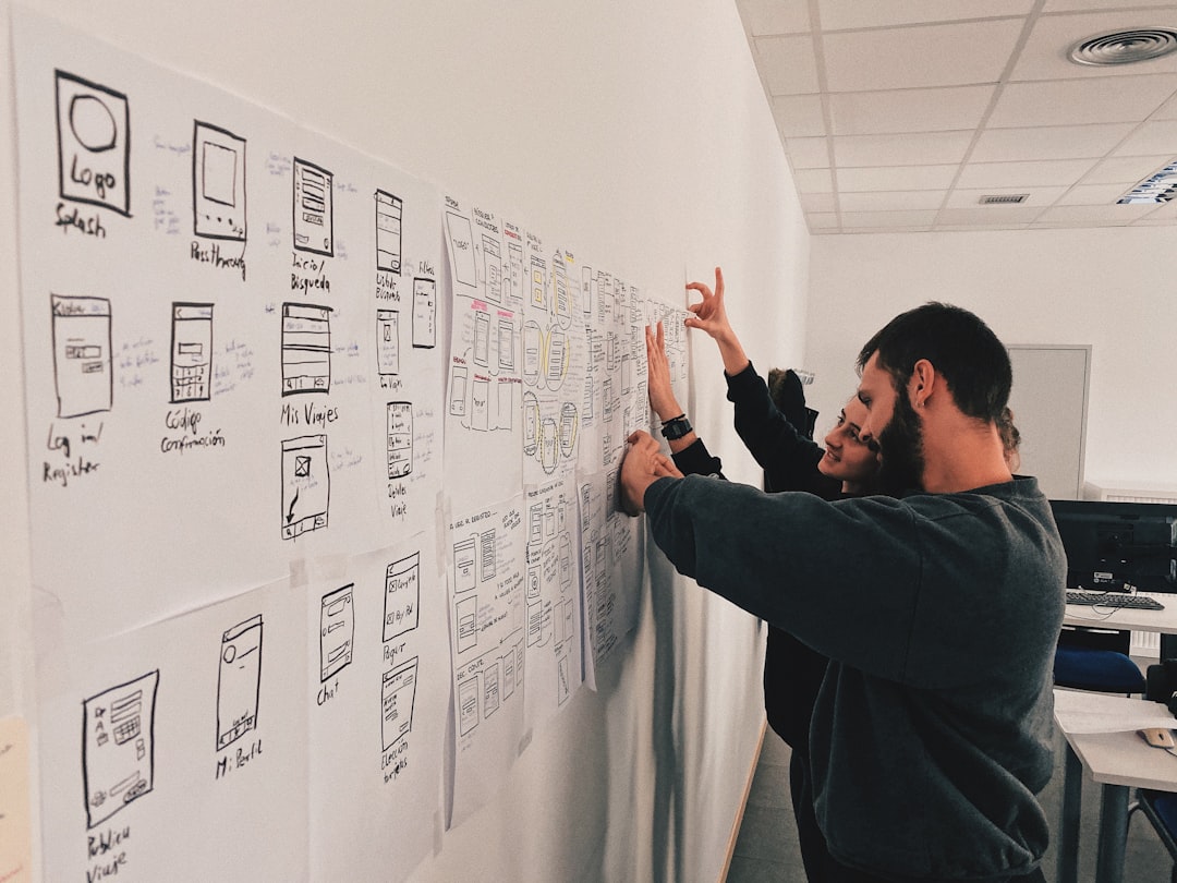
4. Skeleton
Where does everything go on each page? The skeleton is the wireframe — the layout of buttons, headings, images, and text blocks before any color or typography is applied. A good wireframe answers “where does the eye go first?” and “what is the single most important action on this page?” without relying on visual design to do the work. When a page looks beautiful but nobody clicks the call-to-action button, the skeleton is usually the problem. The button exists; it is just in the wrong place.
5. Surface
What does the visitor actually see? The surface is color, typography, imagery, spacing, animation — the visual design layer that most people think of when they think of “web design.” It is the most visible layer and the least important one to get right first. A beautiful surface on a weak structure is a building with a nice paint job and no foundation. A strong structure with a modest surface is a building that works and can always be repainted.
Why does the order matter so much?
Because each layer constrains the one above it. A strategy decision (“this site serves industrial buyers shopping for strapping products by application”) determines the scope (a searchable product catalog with application-based filtering). The scope determines the structure (custom post types organized by product line and application). The structure determines the skeleton (a category landing page with filters, not a single long list). And the skeleton determines what the surface needs to do (clear product photography, scannable specs, a prominent “request a quote” button on every product page).
That chain of decisions is exactly what happened on the Greenbridge rebrand — a project where the product catalog architecture, the custom post types, and the visual identity all trace back to a strategy conversation about how industrial buyers actually shop for strapping. Skip the strategy layer on a project like that and the catalog ends up organized the way the company thinks about its products, not the way the customer searches for them. That misalignment is invisible in a mockup and devastating in production.
What does this mean for a business owner hiring a designer?
Three practical things. First, if a designer jumps straight to showing you color palettes and homepage mockups without asking about your business goals, your customers, and your content, they are starting at the surface and skipping the four layers underneath it. That is not a shortcut. It is a guarantee of rework.
Second, the early stages of a well-run project will feel less visual and more conversational than you might expect. Strategy and scope work looks like questions, documents, and decisions — not designs. That is not a sign that the designer is stalling. It is a sign that they are building the foundation the design will sit on.
Third, the framework gives you a vocabulary for feedback. “I don’t like the colors” is a surface-layer note. “Visitors can’t find the pricing page” is a structure-layer note. “We’re getting the wrong kind of inquiries” is a strategy-layer note. Knowing which layer the problem lives on helps both you and the designer fix the right thing instead of repainting a wall that should have been moved.
If you are planning a website project
Patrick Iverson has been building custom websites guided by Garrett’s framework — and a related process called the 4Ds — for businesses across New Mexico and the United States since 2003. The framework is outlined in more detail on the Process page. If you are about to start a website project and want to make sure the layers are built in the right order, we are happy to walk through it. Bring your goals, your audience, and a rough sense of what the site needs to do. The strategy conversation is always the right place to start.