
A brand style guide is a short reference document that tells everyone making something for your business — designers, developers, printers, employees, contractors — how the brand is supposed to look and sound. That’s it. The shortest useful version fits on a single page. The longest useful version, for most small and mid-sized businesses, runs eight to twelve. Anything longer is usually written to justify a price tag, not to be used.
I once watched a Santa Fe gallery owner unroll a 47-page PDF on a conference table and admit she had never opened it past page three. Her print vendor had never opened it at all. The pages with the actual hex codes and font names were dog-eared. Everything else was decoration.
That gap — between the document people pay for and the document people use — is what this post is about.
The five things a brand style guide actually needs
Strip a guide down to the parts that get referenced in real working hours and you are left with five sections. If your guide has these and nothing else, you have enough.
- Logo files and clear-space rules. The actual files in the formats people need (SVG, PNG, EPS), plus a one-line rule about how much breathing room the mark needs and the smallest size it can shrink to before it falls apart.
- Color values, written down. Hex for screen, CMYK for print, Pantone if you care about packaging. Two or three primary colors, two or three secondary. Not seventeen. The fewer colors a guide names, the more consistent the brand actually looks in the wild.
- Typography — typefaces and the jobs they do. One typeface for headlines, one for body text, optionally a third for accents. Each one paired with the situation it belongs in. “Use the heading font for headlines and pull-quotes only” prevents more inconsistency than three pages of theory.
- Voice in three or four adjectives, with examples. Adjectives alone are useless. “Friendly” means nothing until it sits next to a sentence the brand would write and a sentence it would not. Two short before-and-after pairs are worth more than a paragraph of definitions.
- One do and one don’t, with a real example. A photo of the logo used correctly. A photo of the logo used wrong. People copy what they see, not what they read.
That is the working core. Everything else is optional, and most of the optional sections never get opened.
The four sections that are usually filler
These show up in big-agency style guides because they make the document feel substantial. They are not wrong, exactly — they just rarely change a single decision a small-business team makes on a Tuesday afternoon.
- The brand origin story. A page or two of the founder’s narrative. Beautiful. Belongs on the About page of the website, not in the document a printer needs at 4 p.m.
- Mood boards. Useful during the design process. Confusing afterward, because people think they are supposed to copy the mood-board images instead of the actual brand assets.
- Personality archetypes. “We are the Sage crossed with the Explorer.” Fine for an internal workshop. Almost never referenced when someone is building a slide deck.
- Detailed grid systems for layouts you do not produce. If your business does not regularly publish print magazines, the eighteen-column baseline grid is filler.
None of these are bad to think about. They are just bad to print and bind. Keep them as working notes during strategy and identity work, then leave them out of the deliverable.
How long should a brand style guide be?
For most small and mid-sized businesses: between one and twelve pages. A one-page version is enough for a solo founder or a two-person team. Eight to twelve pages is right for a business with employees, vendors, and a website that gets updated by more than one person. Past twelve pages, the chance that anyone reads it past the first opening drops sharply. The 47-page PDF is a status object, not a tool.
If you are not sure where you fall on that spectrum, start at the short end. You can always add a page when a real, recurring question comes up that the guide does not yet answer. Building from need is far more useful than building from a template.
The minimum viable style guide, on one page
If you want a starting point you can put together this afternoon, a one-page guide looks like this:
- Top of page: the logo, in the version you use most often, at a comfortable size
- Below it: clear-space rule and minimum size, in one sentence each
- Color row: two or three swatches with hex and CMYK values printed beneath
- Type row: heading font name, body font name, one example sentence in each
- Voice block: three adjectives, one “we sound like” example sentence, one “we do not sound like” sentence
- Footer: links to the source files in your shared drive
That document is enough to keep a small business consistent across a website, a few pieces of print, and the inevitable last-minute slide deck. It is also short enough that people will actually read it before they make something.
A note on growing into a bigger guide
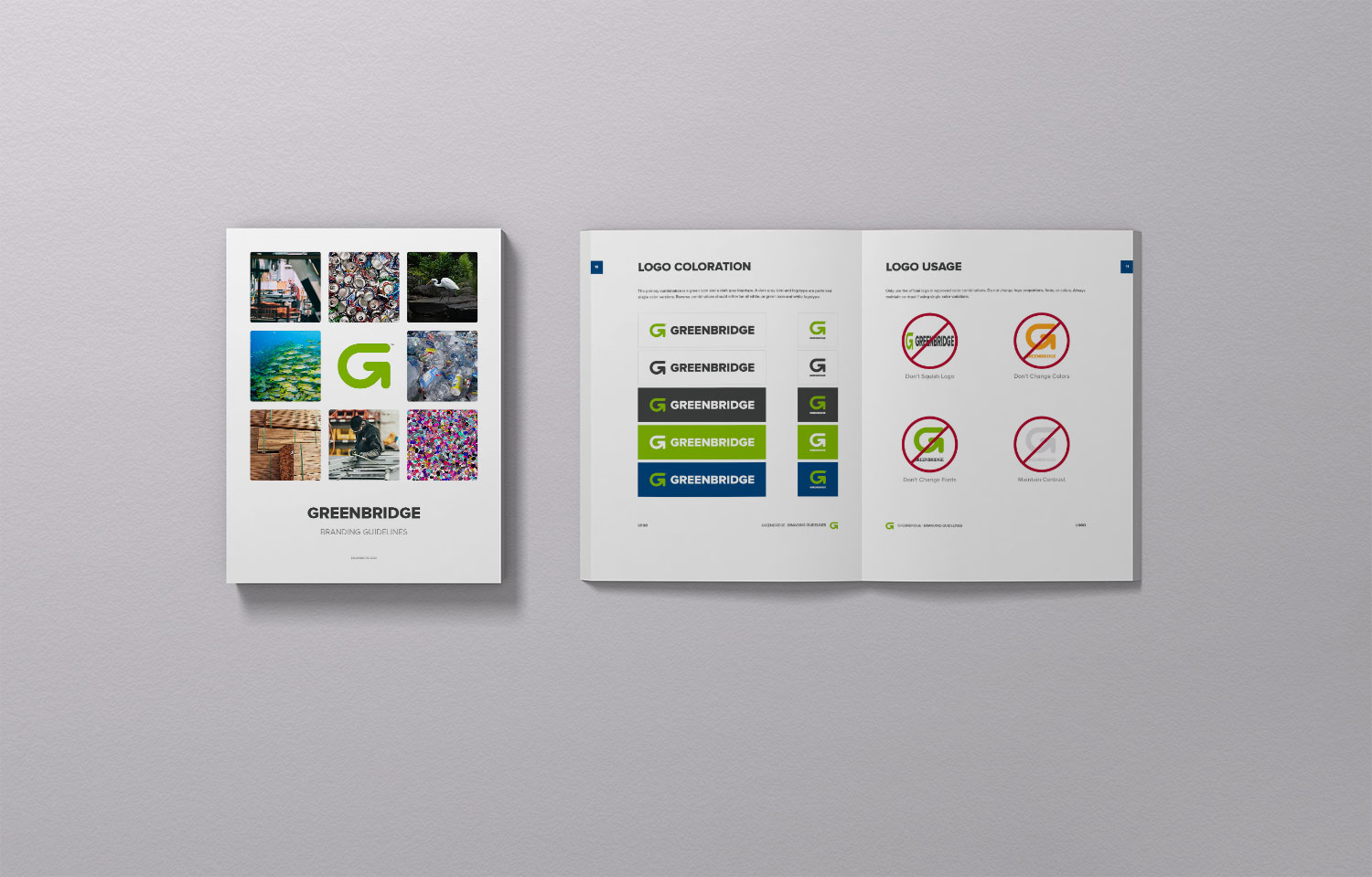
Some businesses do eventually need the eighty-page document — usually when they have multiple product lines, a marketing team of more than three or four people, or vendors in several time zones. The brand guidelines we built for the Greenbridge rebrand are an example of a guide that earned its size: a multi-billion-dollar manufacturer with an extensive product catalog and vendors across the country needed every page it got. The mistake is starting there. A guide written before the brand has been used in the wild is mostly guessing. A guide written after a year of use is built on the questions that actually came up. The second one is shorter, sharper, and far more likely to be followed.
If you are putting one together for your business
Patrick Iverson has been building brand identities and the documents that protect them for businesses across New Mexico — Santa Fe, Albuquerque, Rio Rancho, and beyond — since 2003. The most useful style guides we have made were always shorter than the client expected and more specific than the templates they had seen online. If you are weighing a rebrand or trying to bring some order to an identity that has drifted, we are happy to look at what you have and tell you honestly which pages would actually earn their keep. No deck required — just bring the files you are working with now.