
Santa Fe has a visual identity older than most American cities — a layered confluence of Pueblo, Spanish Colonial, and Territorial traditions, formalized into the city’s built environment by John Gaw Meem and the 1957 Historical District ordinance that still governs new construction downtown. That depth is exactly why so many brands trying to look like Santa Fe end up looking like a souvenir shop instead. The vocabulary is real. The cliches are what happens when you reach for the surface of it and skip the substance.
A winery owner once came into the studio with a mood board: turquoise everywhere, a sunset gradient, a coyote silhouette, and a wordmark in a font that looked vaguely carved into adobe. She did not love any of it. She had assembled it because she thought that was what a Santa Fe winery was supposed to look like. The brand we eventually built used none of those moves — and felt more like Santa Fe than the mood board ever could.
The cliche trap
The cliches are the visual shorthand that tourists carry home. Turquoise everything. Sunset gradients. Kokopelli silhouettes. A wordmark in a font that pretends to be carved from adobe. Concho-belt borders. Coyotes howling at moons. None of these are wrong, exactly. They are real elements of regional culture that have been thinned out by overuse until they no longer carry any meaning. Reaching for them is the visual equivalent of describing Santa Fe to a friend who has never been by saying “you know, sunsets and turquoise.” It is technically accurate and emotionally empty.
The brands that read as actually being from here almost never use any of those moves. They look like they were made by someone who lives at this elevation, in this light, on these streets — and that comes through in choices that have nothing to do with imagery.
The vocabulary that actually works
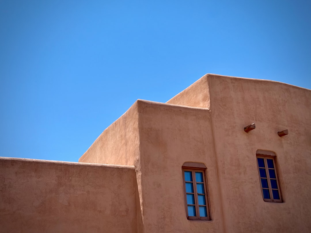
If the cliches are the surface, the substance is in materials, proportion, restraint, and light. Four moves carry more Santa Fe in them than any sunset gradient ever will.
- Earth-true color, used with restraint. Not the saturated sunset palette in the stock photos — the actual colors of an adobe wall at three in the afternoon. Warm grays, pale ochres, faded reds, dust greens, the specific blue of a high-desert sky in March. Two or three of these together is plenty. A brand built on a half-dozen muted earth tones reads as Santa Fe instantly. The same brand with one bright turquoise added stops working.
- Type that breathes. The rhythm of a Santa Fe street is slow. Type that crowds the page is the opposite of that. Generous letter-spacing, comfortable line height, and a typeface with real history — a serif with old-style figures, or a clean sans that does not try too hard — feels right. Anything carved-into-adobe is a tell that nobody on the project lives here.
- Materials over images. Where a national brand reaches for a photo, a Santa Fe brand often reaches for a texture: the grain of unfinished pine, the weft of a Chimayó weave, the matte of an adobe wall, the patina of weathered tin. These do not have to literally appear in the design. Their proportions and surface qualities can show up in paper choices, in edge treatments, in how a logo is printed.
- Proportion borrowed from the buildings. Santa Fe architecture is built around stepped massing, deep portales, and thick walls. That sensibility — heavy bases, generous margins, asymmetry that still feels grounded — translates surprisingly well to a layout grid. Most cliched Santa Fe brands ignore this entirely and are decorated like greeting cards instead.
What does it mean to honor a regional aesthetic without copying it?
The shortest honest answer: it means studying the place enough to understand why the visual traditions look the way they do, and then making decisions that share those underlying values without lifting the surface details. Pueblo architecture has thick walls and small windows because the high desert is brutally hot in summer and cold at night, and adobe was what was here. A brand that shares that why — built for endurance, for honest materials, for a slow climate — looks like Santa Fe even if it never shows a single adobe wall. A brand that copies the wall outline and prints it on a coffee bag does not. The first is influenced by place. The second is wearing a costume.
A small test you can run
Print your current brand at letter size. Pin it next to a wall on the east side of the Plaza in late afternoon, when the light is gentle and the adobe is at its warmest. Stand back ten feet and look at both. If your brand fights the wall — too bright, too crowded, too eager — it is not yet finished. If it sits comfortably next to the wall and feels like it could plausibly have come from inside a building like that one, you are in the right neighborhood. This is not a metaphor. It is a real test that costs nothing and saves arguments later.
The mistake to avoid most
The most common mistake is treating Santa Fe as a theme rather than a context. A theme is a set of decorations applied on top of an otherwise generic brand. A context is the set of constraints and values the brand is built inside. Themes age fast and embarrass the people who bought them. Contexts deepen with time. The Santa Fe brands that hold up at five and ten years out are almost always the contextual ones, and they almost never include a single image of a sunset.
If you are building a brand here
Patrick Iverson has been building brand identities for businesses across New Mexico — Santa Fe, Albuquerque, Rio Rancho, and beyond — since 2003, and the projects we are proudest of are the ones that read as deeply local without using a single cliched element — from RA Organics, a Santa Fe juice and smoothie lounge built around a custom Eye of Ra illustration, to Reyah Sunshine Farm, a 3.5-acre family homestead selling at the Santa Fe Farmers Market. If you are trying to figure out how to make your business look like it actually belongs to this place, we are happy to talk through it. Bring whatever you have — even the mood board you are not sure about. We can usually tell within a few minutes which pieces are pulling toward Santa Fe and which are pulling toward the airport gift shop.